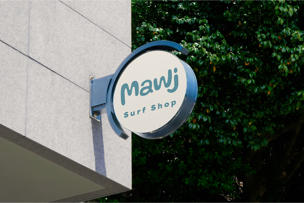
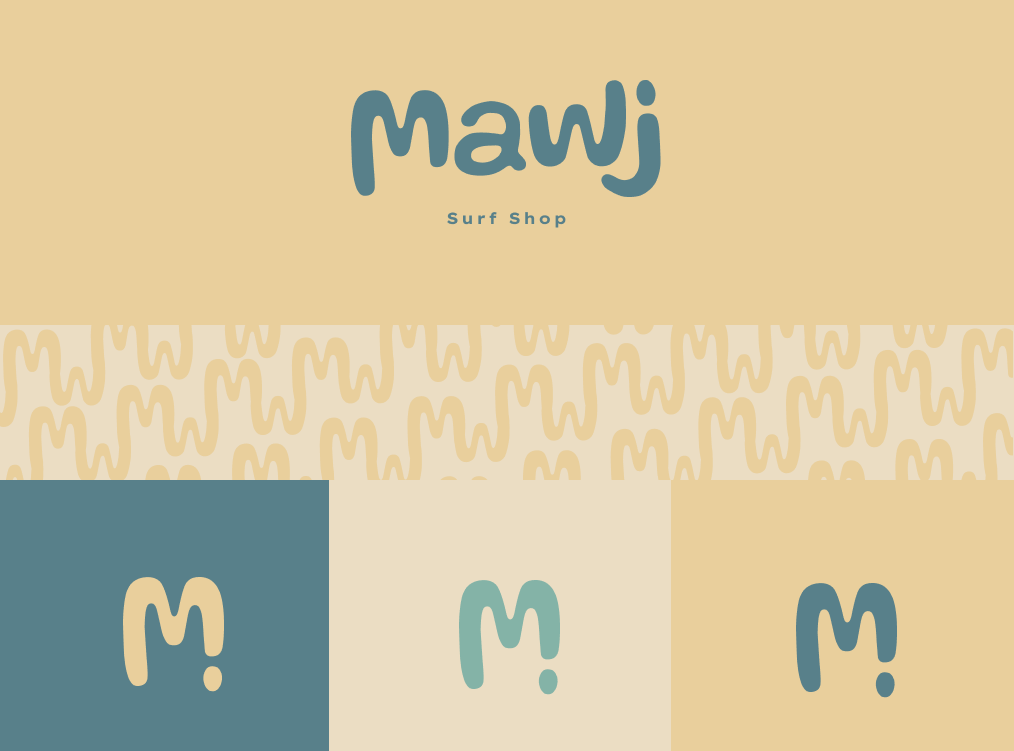
Alternate Logo
The alternate logo distills the identity into a simplified mark, centered around the modified “M” shape. By incorporating the tittle of the “J,” the form gains balance while subtly suggesting a single droplet, adding a sense of motion and continuity. This mark captures the essence of a wave in its most minimal form, making it versatile across different applications. It can be used in multiple color variations from the brand palette, allowing flexibility while maintaining a consistent visual identity.